
Introducing SPAM (a work in progress).
Oh no, another player value stat. Let's talk about it, and some hockey philosophy.

Last summer, I was bored.
While I was hunting for something to do, I was missing hockey.
I wanted to try and make something to project how all 64 teams would finish in the pairwise, using a mix of incoming freshman data and returning talent.
Then I struck out. My scope was too big, and I still had a lot to learn about making things like this.
Then few weeks later near the beginning of fall, I got access to InStat. I did some research and got back into the kitchen.
Having failed at this over the summer, I knew my goal had to be simplified.
I decided all I wanted to do was create something that would help me learn about teams and players faster. Rather than make predictions, SPAM is focused on evaluating what has happened so far to try and help us watch and discuss hockey better.
After a few weeks of research, a few weeks of testing, and a few weeks of doing nothing, I’m finally ready to share the results with you—and hopefully get some valuable feedback, as many of you know the sport and/or analytics really well.
What is SPAM?
Sean’s Player Assessment Measure is a stat based on Dom Luszczyszyn’s original GameScore formula, with changed inputs to include data from puck battles, transitions, and Expected Goals provided by InStat.
Like GameScore, everything is calibrated based on how many times they occur per goal and then scaled back so the total SPAM equals roughly the total Points for a given season. After this, each player is measured on a per 20-minute basis against the mean for their position, and ranked by percentile.
So, if a player has 0 SPAM, this means on a Per 20-minute basis, they are exactly average for their position. If they have .50 SPAM, they would be worth half a point per game more than the player with 0 SPAM over the same time span.
I’m choosing to measure with a permanent midpoint of zero because it gives us an anchor for everyone’s production. This is also a concept you can see in Dom Luszczysyn’s work, specifically with his recent player cards for The Athletic.
What fits in each category?
Here is the best I can explain it:
Everything trickles down into 2 main categories and 2 sub-categories within each.
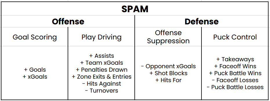
It’s an oversimplification, but in hockey you’re either scoring, helping teammates score, not letting the other guys score, or trying to get the puck. I picked stats that reflect all 4 of these facets.
Goal Scoring
This one is simple. I want to reward guys who are scoring goals, or putting the puck on the net to generate goals. Expected Goals fit into this category instead of play driving for me, just because I see it as more of an individual contribution, while the stats in Play Driving measure your impact on setting your team up to score.
Play Driving
This category could also be labeled “offense that doesn’t involve shooting”, but I feel Play Driving fits everything here except for maybe penalties drawn, which I still included because 5 on 4 time equals high-quality scoring chances.
Hits Against and Turnovers are punished, just because they usually disrupt your team’s ability to make plays. Hits could be considered an iffy choice, but my thinking having seen what InStat counts as a hit is that if you’re getting hit, you’re getting taken out of the play. They don’t live in Puck Control, just because turnovers already cover any lost possession there.
Offense Suppression
Because this is all regulated to the average for your position group, this category is largely punitive for players on the ice for Opponent xGoals.
0.00 isn’t “0 xGoals against,” it’s actually the national-average xGoals against. Players receive a small bonus for blocking shots (preventing xGoals from getting on the net) and making hits (disrupting offensive flow).
Puck Control
Faceoffs, Puck Battles, Takeaways. If the puck is up for grabs, go get it, and this goes up. Very straightforward.
Why Per 20 Minutes?
I chose Per 20 Minutes over running totals or Per Game measures, because I want to put everyone on an even playing field. If the goal is to measure effectiveness, this makes sense, and it keeps things closer across players with different roles.
This has benefits and drawbacks, which we will explore later.
Let’s see an example.
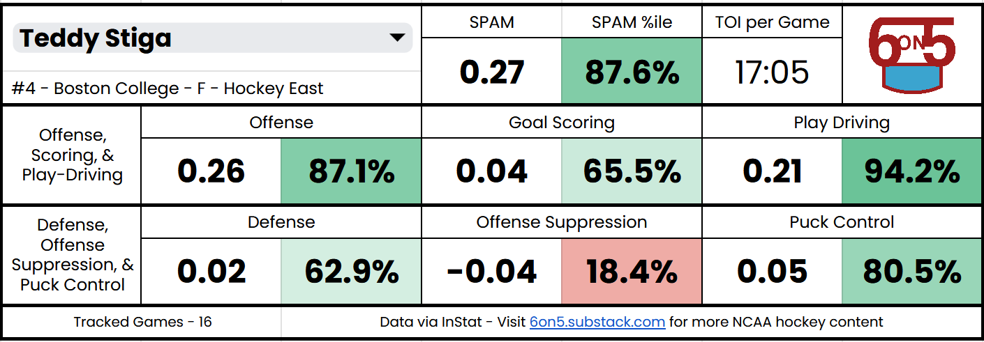
Look at Gold Medal Game Hero Teddy Stiga’s player card above.
His SPAM is .27, which tells us his contributions are worth roughly .27 more Points than the average forward over 20 minutes. He could be better at slowing down opposing offenses right now, but everything else is great for a freshman.
How can you play around with this data?
I thought you’d never ask.
You can access cards and rankings here if you’re interested in data from this ongoing season. If you would like to peruse last year’s data, I’ve made it available here.
For both documents, you will immediately have edit access, but only for the player look-up cells so you can find your desired cards. I strongly urge you to make your own copy of the document, so you can do whatever you like on the player card and ranking sheets without my failsafes or other people impeding you.
One thing I ask for in return: if you’re going to share the cards or data, please do not crop out my URL or logo, and if possible, tag this blog.
I know this is partially derived from InStat’s game tracking and Dom Luczyszyn’s Game Score work. I’m aware I’m not the first person to have this idea and that I’m not some visionary of the game. But a lot of time and effort goes into creating these visuals, testing what does/doesn’t work, making model decisions, etc.
So please give due credit, just like I have to everyone else in this blog.
How does this compare to CHIP & Game Score?
If you follow my blog, you probably have seen College Hockey News’ CHIP statistic and also may be familiar with Dom Luszczyszyn’s work I mentioned earlier.
Thankfully, the first is publicly accessible on the CHN website, and Stephen Zenack from The Field House has done a great job maintaining a record of Game Score performance over the last three seasons.
By no means does SPAM replace either of these metrics. It simply offers an alternate perspective, with different inputs and a new visualization. Any comparison is just to break down the “science” behind each stat, to help you and me understand what each might be telling us.
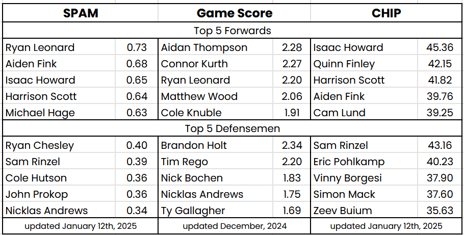
Looking at the Top 5 for each position, here are my first impressions and some light hockey philosophy:
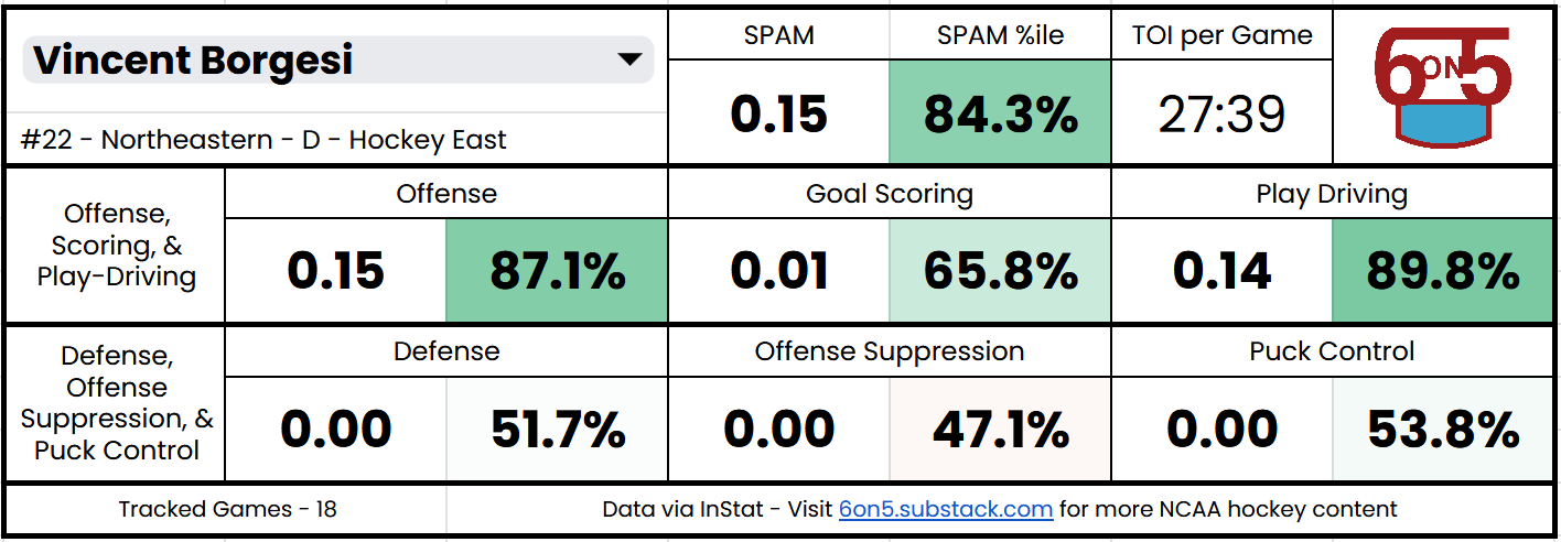
Vinny Borgesi doesn’t appear on SPAM’s leaderboard, as over a 20-minute basis he falls down to a respectable, but less impressive 73rd. This is in big contrast to CHIP, where his Minutes Eater status vaults him to 3rd.
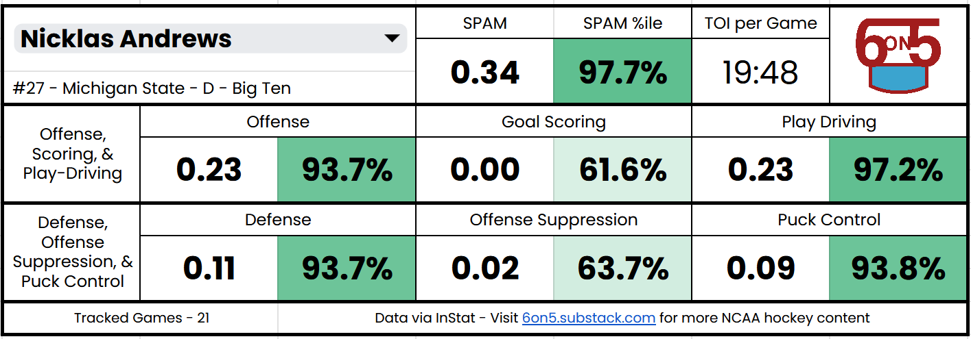
Let’s assume SPAM measures their effectiveness accurately. Are 28 minutes of 84th-percentile hockey more valuable than a player like Nicklas Andrews turning in 20 minutes of 97th-percentile hockey?

My 2 cents: for Northeastern, where multiple defensemen are having well below-average seasons—yes. For MSU, where only one defenseman is—no. It’s possible Borgesi could be more effective if he wasn’t playing almost half the game, but for the Huskies, his absence would mean subpar defensemen getting more precious ice time. Should this be accounted for?
The gap between elite forwards and elite defensemen is much higher in SPAM than the other stats.
How do you compare value across the positions? It seems like the other stats are doing a slightly better job of making things equal.
I am using 0 as the “average” for each position group, so everything works from the same middle, but the value assigned to scoring makes jumping up high easier for forwards.
Is the player who scores at a league-best pace better than the one who prevents chances at a league-best pace?

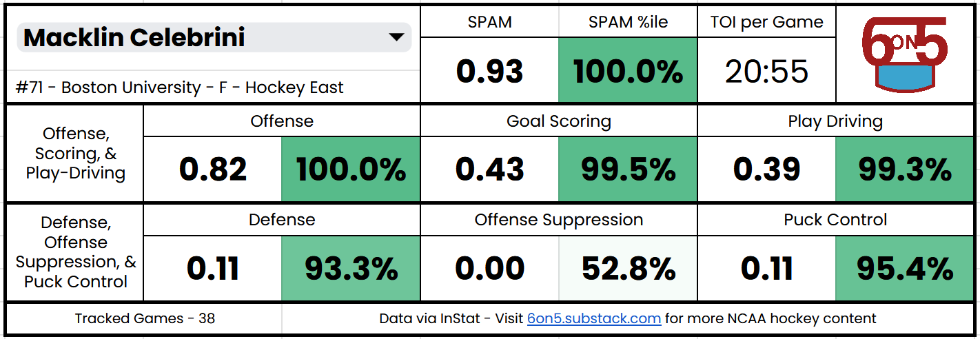
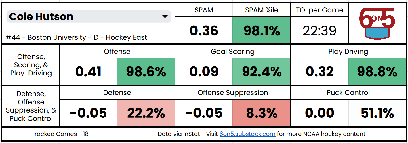
Is Cole Hutson’s spot deserved? Recency bias and the eye test after his monster WJC might say yes, but CHIP and Game Score have him much closer to average than I do.

Given his status as a puck-moving, offensive defenseman, and SPAM’s unique inclusion of transition data, it makes sense that he would be viewed as a better asset to his team. But I am beginning to think that maybe his lackluster defensive ability isn’t being punished enough—what are your thoughts?
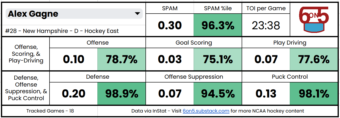
Regardless of potential Hutson-flation, I’m confident that including “micro stats” like zone transitions and puck battles is the right call. Why? Last year’s Hockey East Defensive Defenseman of the Year Runner-Up Alex Gagne is nowhere to be found on CHIP’s leaderboard and 180th in Game Score. He’s 12th in SPAM.
CHIP adjusts for Strength of Schedule, which SPAM and Game Score do not. This means some players in Atlantic Hockey or the CCHA have crept above players on “power conference” teams who may be doing something more impressive, but don’t have the same outputs. This is more noticeable in my 2023-24 leaderboard, which I recommend you check out.

Areas for Improving SPAM
After comparing to contemporaries and using the data myself for the last month, one thing is clear—this first go has a lot of room for improvement.
It’s not bad! But there are certainly questions left unanswered and room to make this even better. Here are some things I’ve tabbed as worth exploring again:
Explore standardizing by Games Played, rather than Per 20 Minutes. I prefer /20, but offering both could be insightful. This will require some tweaking for Offense Suppression, which was designed with rate stats in mind.
It might be worth exploring how to separate Power Play and Penalty Kill time, as right now, every phase of the game exists under one roof.
Continuously re-evaluate and test weights, perhaps differentiating by position? This could allow the same big # ability forwards have for defensemen.
Keen observers may have noticed, I have not said a peep about goalies while writing this. I just don’t have anything on them for you yet. I’ll work something out, I have preliminary notes on how I would do this.
As soon as InStat’s Team xG When On Ice bug is fixed, run the 2024-25 script again to get the most accurate possible data.
The bodged solution with Plusses proxying for Team xG has me thinking, could it be worth doing SPAM and xSPAM?
Should players receive buffs or nerfs for the context they play in (conference, team quality)? Or is the raw output relative to peers what we want to evaluate?
As I mentioned above, I know there are a lot of smart folks who subscribe to this newsletter, so I value your feedback—whether it’s about the actual numbers themselves, the format of the player cards, or anything else.
This big red button will take any feedback you have and send it right to my inbox, or you can reach out to me at sean6on5@protonmail.com.
Conclusion
There’s a lot left to learn, but this is a great starting point for something easy to use and understand.
If I had to sum up where this project is in one sentence, it would be…
Things are moving on the right track and the mix of variables is good, but some of the weights may need to be tweaked to better represent more play styles.
This is my first attempt at something like this, so I’m going to take my wins where I can get them. I feel as if I did a good job creating a mix of inputs that represent a variety of hockey players, and I especially am proud of the Google Sheet.
I hope to SPAM your inbox again later this season with updates on the leaderboard, any formula tweaks, and some thoughtful discussions as to how we can all learn more about hockey together.
This is awesome!